
Cynch Canada
⊹ ࣪ ˖
Cynch Canada ⊹ ࣪ ˖
Cynch

What is Cynch?
Cynch is a self-serve platform that allows users to buy multi platform media campaigns online. Cynch can target audience groups, build and book campaigns at any time, and track performance.
🙋🏻♀️ My role: Lead designer and researcher
🛠️ Tools: Figma, Mural
🌟 Skills: User research, usability testing, interaction design, prototyping, wireframing, ui design
Task
To develop the user experience of the Cynch web app into a cohesive and functional multi million dollar saas product, and design all new features with this goal in mind
Making an information and table heavy product concise and pleasant to look at while being digestible and providing users the data they’re looking for
Needs
Functional on desktop, users want to see info fast and download reports and PDFs that show all campaign info clearly
Users want key info to be up front, digestible and easy to differentiate
Solutions
Reworking the UI and developing a design system to maintain consistency across all pages and match competing modern SAAS products
Design System
. ݁₊ ⊹ . ݁˖ . ݁
Design System . ݁₊ ⊹ . ݁˖ . ݁

-
Cynch is a large saas application with many flows and features. Throughout creating new features and ideation, in the back of my head were always questions about how we can potentially reuse existing components, how are we going to alter them to fit this use case, or should we design something completely new for this. I dealt with a lot of constraints from an international development team causing breakdowns in communications and some mishaps as well as dealing with capacity limits from the team.
This made me decide to create a library of all existing components that were previously housed and designed in Axure and bring them into Figma. I remade every component that was in Axure and ones that I saw existed but were not documented. From there I started an audit of designs and components where I gathered examples of all the different instances of components and identified differences between most of them.
-
After successfully auditing all instances, I categorized them into corresponding components like menu, tables, modals, to even more granular things like dropdowns, statuses etc. After doing all this I turned each component into a jira ticket outlining specifications for the “new” instance and showing differences by showing old vs new side by side.
After the audit I compiled every component into a library and documented each instance and their use cases as well as expected behavior. Each component in figma utilizes properties, variants and if needed instance swaps. I found this process to be pretty challenging but rewarding in the end.


Design System & Brand
Creating a UI library and design system in Figma to make the design experience more seamless and standardized to help developers. We do not use any design library tools other than figma that I was used to using, so I wanted to make figma our source of truth for documentation and specs.


Homepage Refresh
During my 2 years at Cynch I decided to take on redesigning the home page. I received a lot of feedback from fellow designers at Corus that Cynch seemed like a “black hole of information”. I was curious to see if others felt this way and began to seek feedback through user interviews of different users of Cynch.
Identified Pain Points 💢
So much information displayed in table, no distinction, very repetitive
Complaints from customers that this makes the data harder to digest
Users wanting to see more data in the future but have it displayed better
Users want to track of campaign progress without necessarily having to click into a campaign (through notifications or through info found in main table)
Opportunity Points ✅
Refresh the UI of a product that had no updates since it’s first initial launch in 2018
Create consistency throughout the app by creating and refreshing existing components
Make the home page experience feel more like a landing page with useful info and clear options and less like you opened a giant table of information or an excel spreadsheet
Old Homepage

New Homepage

Desktop First Design

Through user interviews and combined use of hotjar and adobe analytics, we found that 100% of our users use desktop to use Cynch. We chose to focus on building out a desktop-first experience.
Though smaller changes, I found these to make a big impact on the feel of the page.I focused on adding padding, making sure spacing between columns, statuses and filters were even, making sure the status pills I added were readable and accessible while being clearly identifiable as they are a new component.
Bringing the top navigation bar down was a design choice to bring a more dashboard-like feel that I found our competitors and other similar saas products to have to the experience, as I’d eventually want to use the rest of the negative space on top of the table for hosting future buttons and CTAs and possibly campaign stats.

-
Dashboard features
Show how many campaigns are completed between period specified (eg. last 30 days, last 60 days, last 6 months)
Show which campaigns are in progress up front, out of the table
Airline flight tracker style campaign progress tracker
-
Break things down!
Breaking this seemingly big thing down into small parts and sections really helped all members of my team be more open minded and receptive to changes as I was able to pitch each part separately and make a case for why many changes need to be made
🔎 Research 🔬
🔎 Research 🔬
During my time at Cynch I’ve faced a few barriers getting analytics tools implemented, but I always have the option of conducting face to face user research as well as sending out user surveys. I’ve conducted several rounds of interviews with my users to ask about new features, testing end to end prototypes and asking about overall pain points and feedback.
I’ll compile the data and do a card sorting exercise with my team in order to show them the feedback and get their opinions on what we should tackle as well.
Wireframes

I work with my stakeholders but most closely with my product manager to create a rudimentary version of our wants and vision of the product to make it come to life. Below are examples of Mural board ideas and figjam wires that were turned into high fidelity prototypes.
User Journeys

An idea spawns from my team and is fleshed out with questions in Mural. I take this back and turn it into a few different wireframes.

After settling on one or two, I mock up some wireframes and take them back to the team to address any questions and get some of mine answered.

Often after a few more rounds of revisions a final version is born and prototyped.
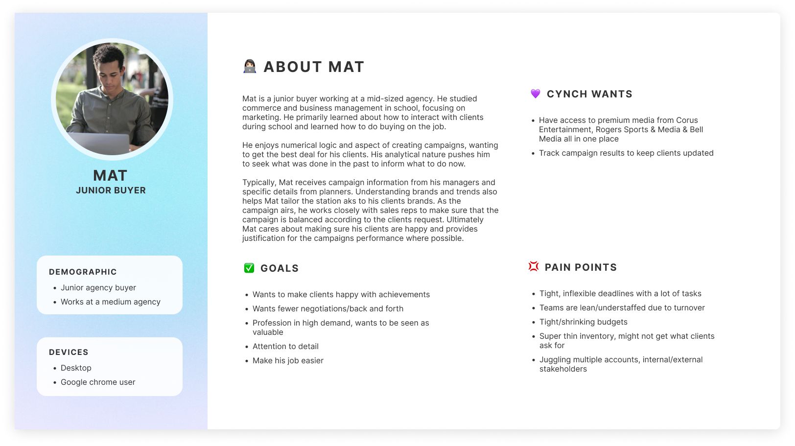
Personas
Through these interviews I’ve also created personas of some of our core users and their challenges, wants and goals.

Below is an example user journey map created while creating the personas mentioned earlier. They follow our 2 personas performing an action using one of the new features we implemented.


Accessibility
Accessibility is taken into consideration with creation of every new component by testing through accessibility plugins. Bi weekly testing is done by the whole team to ensure the product meets accessibility requirements and for general error testing.
View a case study I wrote on the redesign of the Cynch Home Page!