
PartnerStack/ Q1 2020- Q4 2021
design team.
Day to day I am a member of our product design team of 6 people, and the lead designer on my scrum team consisting of myself, a product manager and a few engineers. I am currently on the Communications scrum team which manages all of PartnerStack’s current and future communications including messaging within the app, emails triggered by users in app and all other email communication outside of marketing.

My scrum team, Team Rocket 🚀
shipping
at a startup. 🛳
Previously I was working on redesigning features on the Vendor side of our web application. Shipping features on this side of the app was exciting yet challenging due to the nature of touching important pages that vendors rely on PartnerStack everyday for.
Doing user testing for these features was extremely interesting and insightful and through this user testing we were able to find beta testers willing to test out all our new upcoming features.
I typically see projects through from start to finish as the only designer on a scrum team, collaborating with engineers, product and tech leads on roadmap, sprint planning and then doing QA on a final product. The process is rigorous but rewarding.
case study:
partner details project. 📓

Miro board of high level ideation on the feature.
This project was essentially framed from the point of view from the vendor.
The problem statement being “As a Partner Channel Manager I want to assess and review my partners performance and activity through this data.”
This was part of an Epic the team had with a plan to improve the experience of Partner Managers at PartnerStack.

Notion documentation of our user interviews conducted on the feature.
We worked closely with CSMs to identify customers’ pain points within this view, how the experience was hindering their success & how might we make this experience easier for everyone.
Once we had all the use cases and user flows mapped out, we began to map out some wins we could make while redesigning and began from there.

Quick wins documented, easy to make changes to improve the experience.
From here, I started wireframing and ideating back and forth with my PM and coming up with designs to solve our current user problems while keeping in mind the constraints of the scope and design system.
Below you can view the old and new designs as well as a screen recording of me demoing the new page within the app.
Through the ideation of this product, we discovered the use cases of having a “drawer” component. A component which slides in and out based on what the user clicks. Actions can be performed within the drawer or more information can be displayed regarding what the user clicks.
From this, we decided to make the drawer into a component in our design system and it is widely used today across the PartnerStack app.

Screenshot of the current state of the product that we built off of.

Building out a few different ideas for the improved page.

A closer look at the new mockup of the page.

Screen recording of the new page in app once shipped.

Demoing the "drawer" functionality born from this feature that we implemented into the design system, and now exists as a feature across many pages in the app.

case study:
email modernization project. 📧
redesigning all of PartnerStack’s current and future emails to reflect our design system and UI patterns within the app.

Old vs NEW emails.
The problem:
In Q2 PartnerStack decided to migrate our currently supported email platform from SendWithUs to SendGrid.
During this migration, we also decided to tackle some challenges brought up by users and internally related to emails. One of those steps was a redesign. The goal of this redesign was to help bring forth the PartnerStack brand as well as vendor brand if the email is sent from their end.
Our current emails were getting negative feedback due to the fact that they were basically just text and links. There would be emails letting partners know they can withdraw their money, but who wants to click on an email link that looks like this, that also went to their spam folder?
some considerations:
This was the first project myself and my scrum team worked on without a PM, so I had to take charge of determining scope, fitting all the work into our sprints in between backlog and tech debt work. With the help of my patient and hard-working team of engineers, we were able to scope this project out and make things work albeit a little more slowly than with the help of a PM.
I took charge of getting in touch with our CSMs, asking about email pain points from customers, investigating and documenting all of our current emails, getting eyes on the existing copy, footers/headers, etc. I did some research on other companies’ emails and took inspiration from some emails I was currently receiving from companies.
the goals.
After I decided on some specific formatting for the emails (for example, each email will have a header and footer, set padding, optional content, email signatures) I began to think about how to automate/streamline the design process — not just for myself but for anyone who would need to make emails in the future.
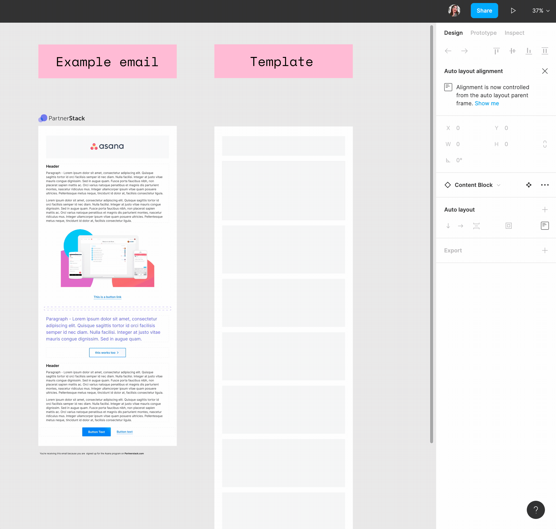
I began to build out content blocks using the Figma component system using variants and different styles. The goal is to create an easy-to-use email template system that allows fellow designers to build emails that will match our style and be easy to execute by the communications team.
Using this my created email design system, I was able to quickly get out quality-looking emails to replace all of our existing ones. This made developer hand-off really seamless.

An overview of the component system I built for the email templates.


some issues:
This project was insanely messy to QA. Not only did the emails have to be QAd on mobile desktop and tablet, but they also had to work on Outlook, Gmail, and yahoo. There was a multitude of issues with dark mode enabled, little nuances with formatting. My engineers developed a solution to help me in the QA process by whipping up a tool to preview the new email designs as they were working on them, as well as be able to send them to myself on different email platforms in order to see the exact formatting and design on an actual device, from a live email.
Another messy part of emails — my devs and I would joke that we were designing/developing for stone-age technology. We would go back and forth on how best to show images, icons, etc as some technology was not supported, we ran into numerous issues with our CSS and fonts.
Some other concerns were with copy. We do not have designated copywriters at PartnerStack so all of the footer and email starter & signature content had to be run through CS. After the emails shipped we still got bugged about some specific copy changes by other CS users as it varied between vendors and partner emails, as well as emails that came directly from PartnerStack related to accounts.
Looking back:
Looking back on the project, I would have taken many more steps to QA had I known how difficult this project would be for my engineers. I was their point of contact for this project since we had no PM and I definitely could have done a more thorough job looking at all the considerations, but i think we did amazing working with the little team we had and our given constraints and time limits. This project was a huge part of our success for Q3 and moved progress forward a lot on our Q3 OKRs.
outcomes:
The outcomes of this project were that now, all current emails have been moved over to our new designs. These designs align with the way our website looks as well as follows interaction patterns and UI from within our web app. This makes the entire experience using PartnerStack — even if it’s external like an email more cohesive and seamless.
There is no more confusion of where the emails are coming from, whether they are legitimate or spam or not. In the future we’d love to find more opportunity to pull the vendors branding into these emails to create more of a fully customized experience rather than a “white labeled” feeling one.

design sprinting. 🏃🏻♀️
I have experience running design sprints such as one feature focused one I have been pushing to get our component system to be more accessible. Understanding the users needs VS our capacity to create a whole new version of one of our most used components across out features was the main struggle of this design sprint.
Using FigJam to collaborate with my colleagues we were able to make our first online design sprint feel almost similar to an in person one with our style of sticky-noting breaking off into teams and spending whole days ideating together.
* This is a current sprint that’s been delayed due to priority changes within the design team, but check in with me if you’re curious as to how this project is going!

design system stuff.
I am currently in the process of changing over our existing icon library (which consists of a mix of material design and iconly icons) over to FontAwesome icons. I have matched all of our existing icons to FontAwesome ones and I am working closely with one of the front end engineers on my scrum team on migrating them over as our fun “side project” outside of sprint work to move our design system forward.
Check back soon to see how this went!